Overview
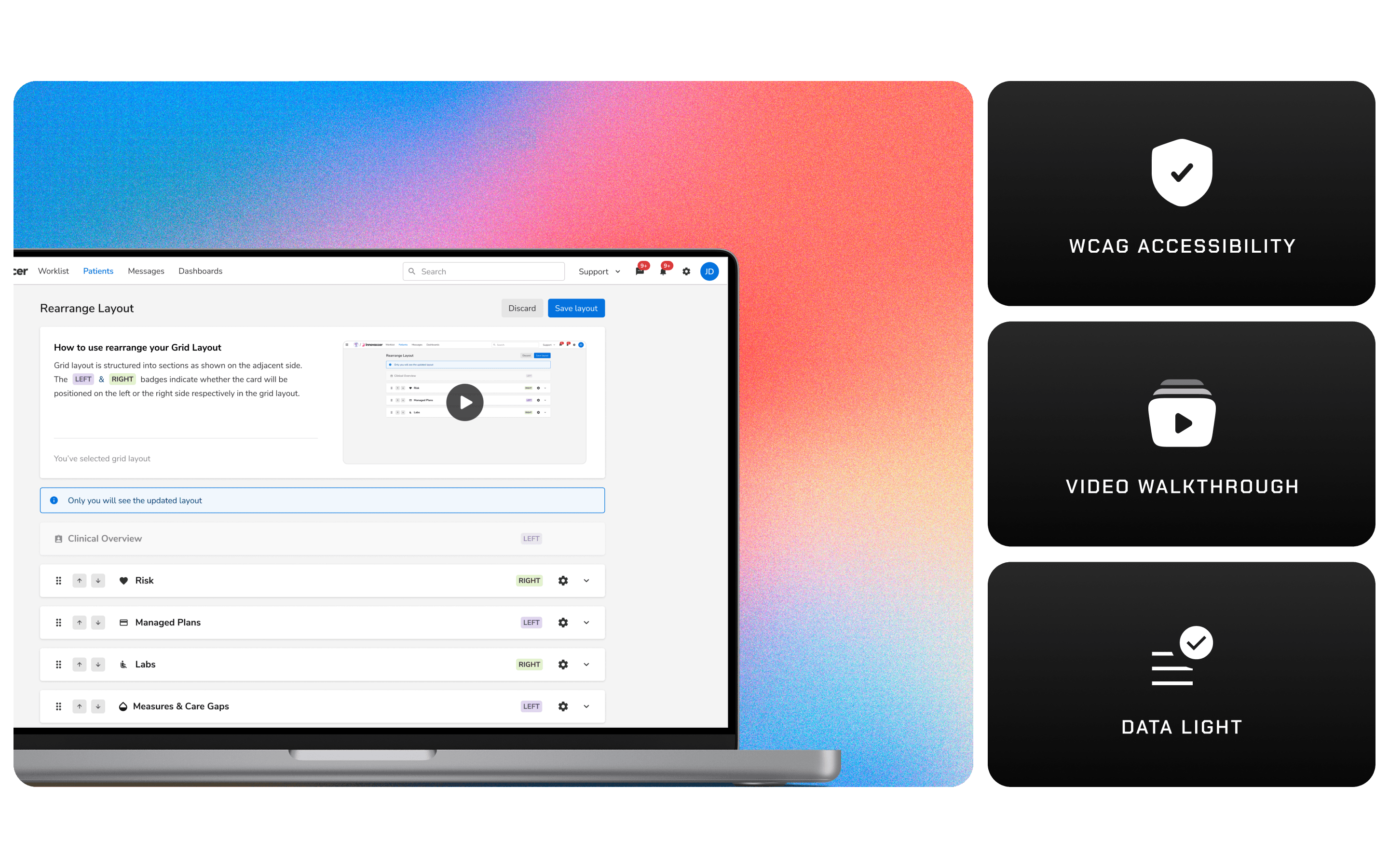
Boosting workflow speeds by enabling user level layout configuration with WCAG level of accessibility
Hi, I'm Rajat AI. Glad to see you here!
Since you are here, let me tell you about the time I designed a high impact feature at Innovaccer. Ready to dive in?
Absolutely! What was the design about?
Great! This design was about allowing user at Innovaccer to make their workflows more efficient & seamless with the ability to manage & set their own layouts. I handled the complete UI, UX, Interaction Design, Psuedo-User Testing.
Interesting! What were the key features you implemented?
There were several key features designed, main ones being:
Layout Customisation:
Users could easily switch between grid and list views from a popover menu.
They could reorder the cards on the screen to match their preferences.

Card Custom Settings:
Users could toggle the visibility of data columns.
They could choose their preferred sorting method.
Data columns within any card could be reordered.

Admins will set the initial default layout for all users. If the user changes the layout, the newly saved layout will become the default layout for that specific user.
This sounds good but isn't this a slightly straight forward design solution?
You are right but we had a different set of challenges here! Since most of our users are relatively aged people with some of them having physical limitations, some might not be comfortable with using drag & drop with their laptop trackpad and lot of them are not well versed with technology,
So we needed to build a highly accessible solution such that any kind of human limitation or machine limitation will not impact the usability here. We mainly did:
Button Controls for Reordering Apart from drag & drop: In addition to drag-and-drop functionality, we implemented buttons to move cards up and down. This feature addresses potential issues arising from faulty hardware or health conditions that might affect mouse usage.
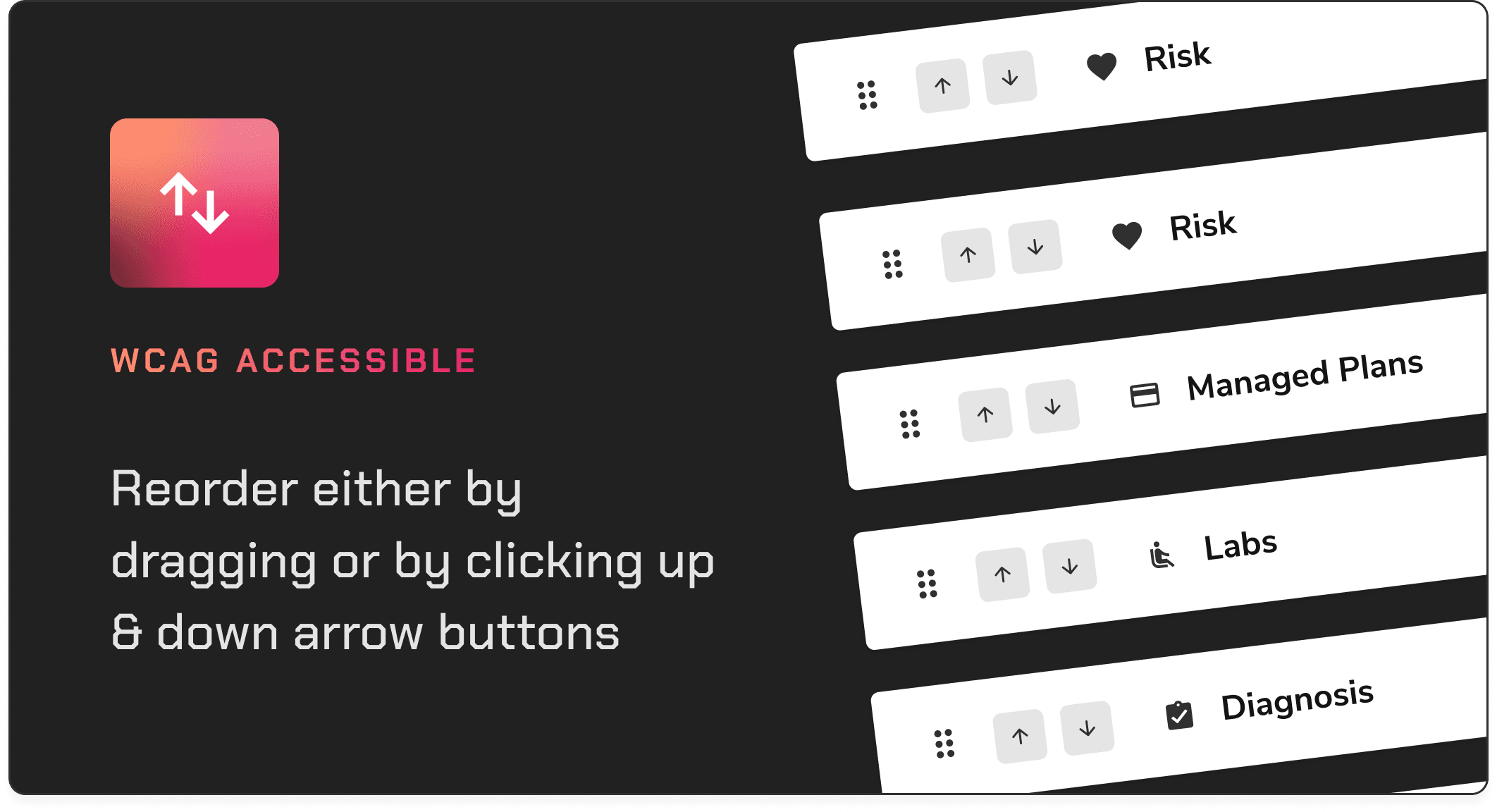
Data Light Design: We ensured that every element of the interface is easily navigable using trackpads or mice, catering specifically to the ergonomic needs of users aged 40 and above.

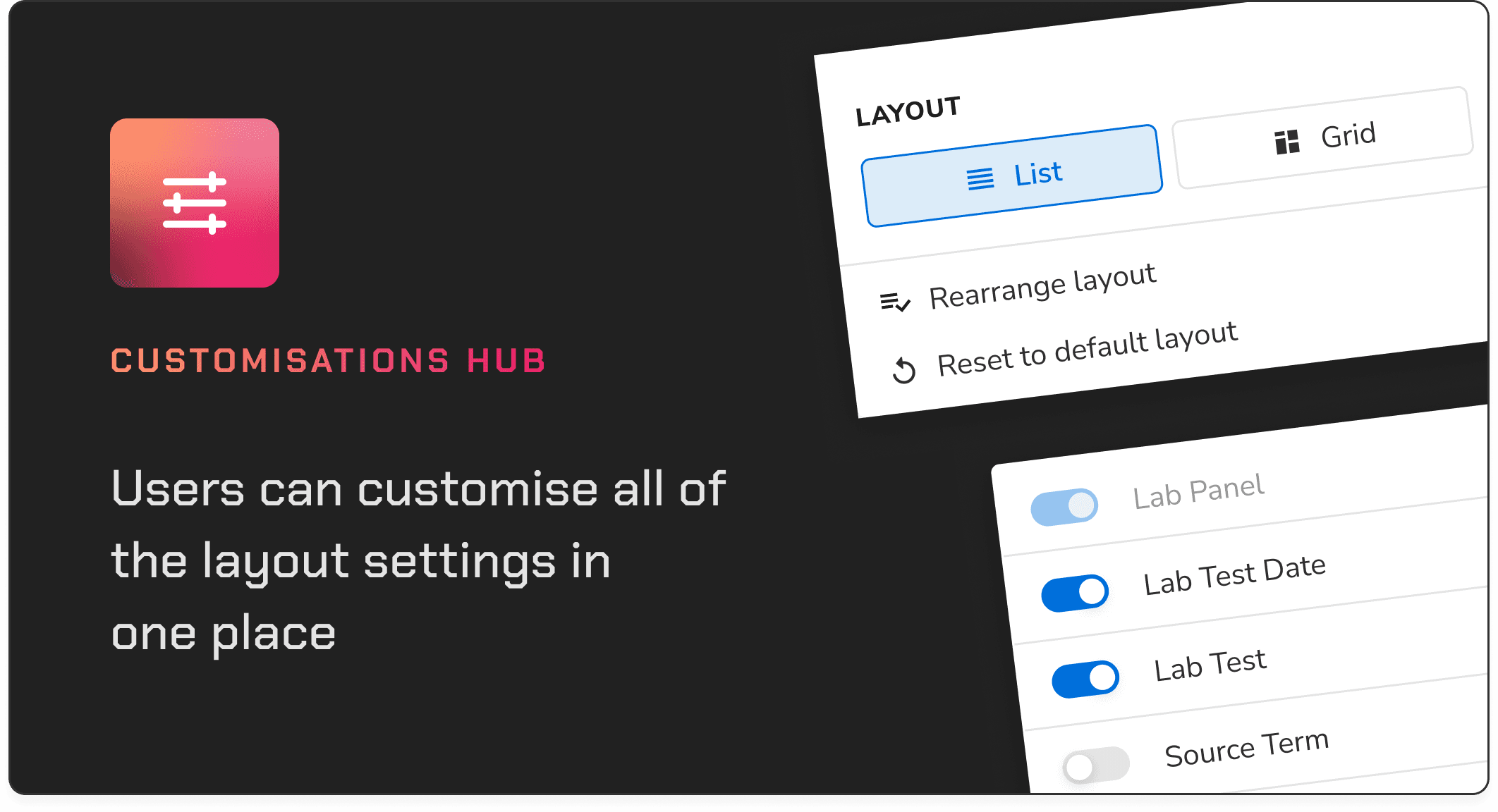
Single space for managing all layout & data related settings: I knew that this single space should work as the customisation hub for the user. So adding other customisation options like data sorting methods, viewing/hiding data columns and default layout options.
Intuitive Walkthroughs: To make the learning curve easier & improve the adoption of our feature, I created a detailed walkthrough highlighting the steps to be taken to customise one's layout. This would help people understand the method & also understand it's usage with grid layout.

Oh, now I get it. What else?
After initial interviews with our SMEs (psuedo users), we found out that some users might not have complete understanding of the card by just eh card name. So although we hid the data from each card by default, user could still expand it & to see the detail for making decisions.
We also added video walkthrough on top to help users understand this better which was a interaction design built using Figma & Principle.

Interesting! Were there any challenges that you faced?
Oh definitely. Normally one would not expect any challenges here but we had two.
Grid View
Grid view was one of the layout options apart from List view. Grid layout was currently being used by extremely less number of users ~3%. The main reasons for it was our product was not yet optimised for grid view. There were lot of issues with truncating, wrapping, overflow behaviours & it also introduced horizontal scroll in most cards which was not desired by users.
So to avoid wasting bandwidth & resources on tweaking our solution for gird view also, we took a very different path, something which we normally don't see in mature products. I explored few workarounds & eventually we all agreed on having the left & right badge as the solution as the temporary workaround.
This would help us save time & resources which we could use to actually improve the grid view. Once that would be done, we could then update our current solution for an optimised experience for any layout.
Speed
Having more than 20 cards with large data sets had made our systems, not the most fast in the world. Since this was a drag & drop feature, I wanted the whole experience to be lag free.
To address this complication, I devised a design to not show any data by default but still allow users to see data if they need to.
This was a win-win situation for both, the product team & the users.
I get it. These are something very specific to your product since it's a large scale, data dense application. What about user feedback?
We had another constraint which I did no mention earlier, which is about the availability of users.
Working in a very tightly regulated industry, we could not frequently & directly reach out to users. We would get certain slots which would not necessarily align with our timelines. To tackle this, we had SMEs or Subject Matter Experts in the company. These were the people who were the users earlier & have quite a lot of experience about the healthcare industry.
So we took the design to our SMEs (pseudo users) & they were thrilled to see the impact of this. I'm not being overly dramatic here, they were actually really excited to see this & envision the future possibilities of it with role based permissions & role based workflow creations.
Hmmm & since it was going to be rolled out to a very large set of users, how did you ensure users understood the new features?
We wanted to make the feature launch smooth, so we did:
Admin Walkthroughs
Admins from each customer gave users the guided tour of the new features.
Help guide & resources were also shared with the team over email.
In-Interface Guidance:
We included a walkthrough GIF at the top of the layout management screen.
Reset to Default
To prevent any change anxiety, we also had the reset to default option.
This would allow users to reset to the layout that was set by their admins.
It sounds like you covered all the bases. What was the end result?
The result was a user centered design that made layout management much easier. Users could customise their screens and the interface was accessible to everyone, especially those with specific needs.

Thanks for sharing this! It's impressive how you balanced functionality and accessibility.
Thanks! Have fun exploring my portfolio.